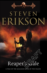
New covers for the MBF

Werthead

Lemming of Discord
Joined
Jun 4, 2006
Messages
2,188
I hate it when they do this. From the paperback of The Bonehunters onwards, the MBF is being totally repackaged in new covers with a new cover layout and design. Whilst Bantam going to lengths to push the series is a good thing, I'm less convinced about doing it in a way that annoys established readers who've been with the series since day one, who are going to have six books with one style and four with another.

Here's the new cover for The Bonehunters. I'm not impressed to be honest. The recent ASoIaF and WoT reprints worked because the covers were designed to appeal to outside the established fantasy field, but the new MBF ones don't really do that, at least based on TBH. Oh well. Guess we should wait to see what the others are like.

0553813153.01._SS500_SCLZZZZZZZ_V45181860_.jpg
 
well I like it, I never liked the orginal cover and feel it needed to be different, i think its the only cover which isn't right, my fav has to be GOTM, really captures the imagination
 
Hell, anything's better than
erikson-deadhouse.jpg


Fortunately, being British I don't have to put up with this crap. :D
 
Well, I don't mind the cover but it's going to be really irritating for me to have half of the series in one style, but I suppose I'll get used to it.
 
I wouldn't say it's quite as bad. It's managed to avoid the stupid quote at the top, at least. Still horrible though:(
 
I really don't like the Reaper's Gale cover :(

By the way, what's the other one about? Looks kind of DHG. Only terrible.
 
It was the original US cover for DhG, yup. We saw it and kicked up such a fuss that they used the UK cover instead :)
 
Yeah, Pat got sent a draft copy, which he posted on his Fantasy Hotlist...

Reaper's_Gale.jpg


A bit to Conan-y for my liking:(
 
Awful, the only good thing is it isn't quite Conan in pants.

The old covers were great, not Conan, and not cheap, dull, standard covers with crap artwork.

You can make simple, classic, fantasy covers, i like the WOT covers, and the ASOFAI covers. The cover of the new MMPB "Magician" is excellent, i like the Hobb covers. Different ways to do good fantasy overs.

And of course the great job down by Harper Collins with Tolkien. Simple. Classic.

These are garbage, unimaginative, too simplistic, with a god awful motif, and crap artwork.

I bet they've spoiled the look of the inside too, i loved the type face and layout etc.
 
I have no taste as I like it, don't get me wrong nowhere near as good as everything up to and including MT, but I didn't like the cover of BH, its loads better than that, but I hope they don't adjust the internal format.
 

Similar threads


Back
Top