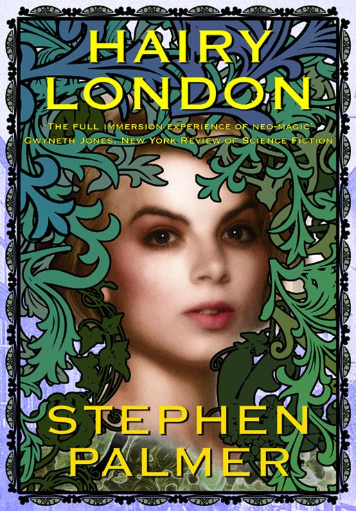
"Hairy London" front cover reveal

Stephen Palmer

author of books
Supporter
Joined
Dec 22, 2009
Messages
6,504
Location
Shropshire
What d'you think?


HairyLondonmark5_zps40379f67.jpg
 
I think it is an eye catching, well executed picture

BUT

Why HAIRY LONDON and a picture which has neither hairiness or urban-ness?

That is the first thing that struck me about the cover.
 
Er not entirely Boneman. :)
More a "pardon?" kind of reaction. I'd probably take it off the shelf for a look inside, but not in an entirely positive frame of mind. So not reaching out with a "hey wow, that looks totally great" reaction, but more a "where is the author coming from I'm a little bit curious because that looks a bit odd to me" frame of mind - which is more easily put-off from continuing to read than the first reaction.
 
And all the leaves and stuff are "fin du siècle" ironwork?. Or maybe not. I know they're a type of cast iron ornament popular to this day, but I think they originated much earlier. What the devil ARE they called?


I've read your samples. I guess that's the rampant greenery that's a major factor in the story.


The excerpts DID have a bit of an Oscar Wildey feel. Very good cover overall.
 
Great Cover, Stephen. :)

Is the next one Hairy Newcastle, can I be in that? LOL
 
Definitely an eye-catching cover, Stephen, and the title is intruguing. :)
 
I think it's an intriguing cover and an eye-catching title.

Very different from any of your previous covers. But you did say this was a new direction in your writing, didn't you, Stephen? So that would fit.
 

Back
Top