Tickety Boo Covers Feedback Forum...

Gary Compton

I miss you, wor kid.
Joined
Jul 8, 2007
Messages
3,247
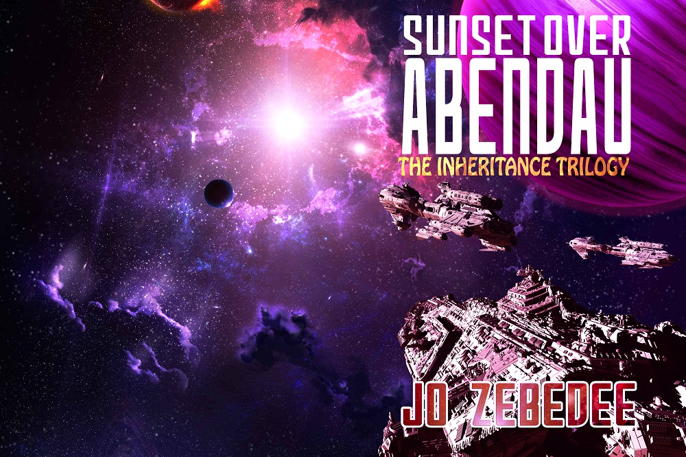
I am looking for some feedback on covers I am working on. The first one is Sunset Over Abendau by Jo Zebedee.

It's the second book in the Inheritance Trilogy

What do ya think?
Sunset.jpg
 
I like it. Ships look good and it gives you a sense that they are closing in on something (not that I know the storyline). There's a lot of purple there so I had a look at some pictures of galaxies and - sure enough - there's quite a few with purple so it seems to be fairly accurate colourwise.

Apparently the colour is related to the types of gas present:)
 
I like it too, and it's very striking. It's a shame, though, that the ships and the sun won't be visible on the same side of the cover. And nit-picking, the small black planet is being lit from behind and below, but the star is behind and above. I'm also not sure the purple planet is being lit from that star, but it's less obvious. The black one, though, is obvious. Can you rotate it?
 
Err...good to have the sun on the front, as HB says, but now the ships are lit from entirely the wrong direction.
 
My personal preference would be to have the larger ship at the bottom, as in the first image - as that looks like an active image - with the sun in the middle, as per the last image, to ensure the lighting is correct.

But remove the other two ships, as they are lit from above, and it messes with the composition IMO, and aren't necessarily doing anything.

That's just me, though. :)
 
I think the ships are much better in the first one, with the lighting on top, so it may be that the sun just needs to stay where it was, unfortunate as it may be that it's not on the front.
 
First impression was WOW! But on serious reflection I now think F*#$%ng WOW. Just my two bobs worth but I would stay with the original. It's great.
 
Perhaps I have very strange settings on my laptop, but the colouring is very ...pink...
Certainly unusual. Sorry to be the odd one out, perhaps it will grow on me :(
However the semiotics of pink aside, I prefer the lighting as TDZ has pointed out, in the first image.
 
The only pink to me is the clouds above the sun -- the rest looks purplish to varying degrees. But everybody's eyeballs are different. :)
 
Hi,

For me the main issue is that the image is static. There's no sense of anything happening. Can you put rocket tails perhaps on the ships? Or have them fire at something?

Cheers, Greg.
 
I like the lighting best on the first one. There's no reason there can't be another light source to the left and behind, but outside the picture.
It had more of a sense of movement than the darker one. I could feel the ships' relentless and rather menacing approach. The two different ship designs added to that menace somehow.
 
I'm looking more at Jo's name and the title. The title's font matches the first book "Abendau's Heir" so that's fine. The color and font of Jo's name, though, blends into the background and is obscured by the star cruiser. The only bit of non-pink/purple is in the subtitle, "The Inheritance Trilogy" which also matches the first book, except that in Abendau's Heir the cover was very yellow and gold all over. Now it's a contrast to all the pink/purple and it really pops out. My eye goes straight to "The Inheritance Trilogy" and I have to squint to seek out Jo's name.

Suggestion, what if you tint Jo's name to be more blue and less pinkish purple? Very light cobalt blue to match the illuminated nebula wisps around the little dark planet which is now really hard to see?
 
My vote:

Author's name should be far left* and all text needs to be treated with a slight blur and slight internal glow. I'd also recommend a blur glow or burn on the layer that has the planet as it looks like a sticker at the moment.

Also, are the ships moving? If so, it may be nice to have some sense of engine light and motion.

*unless of course, that is the wraparound for the back in which case I don't know how to de-clutter the effect of having the name in a colour so close to the purples on a colour wheel.

Also I think you need Batman style pew-pew pew-pew words coming from the spaceships ;) :D

pH
 
I think the image is very striking. I agree with Foxbat that it looks like they are closing in on something, which to me is intriguing, even a bit ominous. You seem to be developing a distinctive look for the series, although I think this cover looks more exciting than the first. However, I am one of those who are seeing a lot of pink. Even if it is a matter of different computer screens, maybe you could shade things a hair toward blue? On the actual paperback book the colors would probably look as they are supposed to, but maybe you need to make allowances for what people who are picking up on the pink might see when they look up the book on amazon, etc? Just a little shading of blue would probably be enough.

But I think it is a very impressive cover.
 

Similar threads


Back
Top