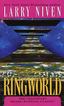
Are modern science fiction covers tasteless?

gdoc

Well-Known Member
Joined
Mar 19, 2014
Messages
148
I find many modern science fiction book covers tacky. Many look like they were designed for ten-year-olds. There are exceptions of course, but a lot of them seem to fall back on scifi fonts, dodgy images and - my pet hate - quite nice images completely obscured by text.

This could be said of any genre no doubt. But do others agree?

Here are some old and new examples that make you wonder just what they were smoking.

Foundation 2.jpg
Foundation.jpg


Currents original.jpg
Currents.jpg


di_fate_niven.png
Ring.jpg


Drowned original.jpg
Drowned.jpg
 
I agree , they don't do covers like they used to.:)
 
Uh huh, this is a topic i've been struggling with for some time, in my opinion you are absolutely right, the cover art of the field is in sad state.
I'm not saying all art is bad, but even if you find a publisher who is willing to pay any decent art, often they will slap some awful gimmicky fonts all over the book and ruin the art completely, those typesetting people should be sued for negligence :D

Sometimes i think that i see only good art from the past, and the bad one is forgotten, but i don't think that is the case.
As to why, i'm not experienced enough to make a judgement, publishers are cheap and don't want to pay? In the past SF was an exciting field and good artists were happy to experiment with it? i dunno..
In any case, i see far to many realism done on the digital canvas, that turns up awfully bland, i don't want realism, it's science fiction, i want artistic expression
 
I really don't understand the approach of some publishers towards some book covers. They want authors to be seen as brands, yet keep replacing iconic covers with substandard ones.

Frank Herbert, Sven Hassel, and Terry Pratchett come to mind where original and striking covers were given less effective - and often poor - replacements.

And then you get the bizarre practice of giving each book format a unique and different cover - ebook, paperback, hardback, trade edition - making it impossible to tell it's the same book at a glance.

Here's a suggestion to publishers - when you come up with a great cover, stick with it. Don't keep wasting money on "refreshing" it and then talk about how cash-strapped the industry is.
 
Last edited:
Um... I don't know what it says about me, though I flatter myself I've got a good eye for design, colour and font (and people who've bought my work must have agreed), but I preferred the new version of each of those save the Niven Ringworld, which was a draw, because the fuchsia top and bottom was too intrusive on the new one. The new versions are cleaner, fresher, smarter and to my mind far more intriguing. But then, I'm not keen on spaceships, and I'm quite happy not to see one in its entirety.
 
A lot of this seems to boil down to whether you like Chris Foss' pictures. I don't mind them, although they're very samey. Anyhow, I'm not sure the good old days were all that good. There were some truly awful covers, as seen here: Good Show Sir - Only the worst Sci-fi/Fantasy book covers (although drawn, some of these are of the Vallejo shiny-space-undies school and might not be ideal for work).

I don't mind any of the covers in the original post much, although none of them is great, and the new Ringworld one strikes me as particularly weak. At least they haven't gone for the standard cyberpunk cityscape being overlooked by a lady in tight trousers (back view) and a samurai sword (and perhaps a panther). I can't remember where I saw it, but I remember someone lamenting the fact that, for a while, there was pretty much one image that occurred on urban fantasy covers, and that was it.
 
I must admit I like Chris Foss' work and others of that style and I do tend to prefer the older covers. I'm sure there are some new covers that I like as well, but I can't seem to think of any at the moment. I think ebooks are making cover art less relevant so publishers aren't all that interested in presenting something unique that will set the book apart.
 
"Tasteless" may be a good word, in the sense of lacking flavor.

I'm going to borrow the idea here for a similar thread on fantasy covers.
 
Originally, SF covers were a huge part of the attraction, they really were, because there were no movies, let alone movies in color, that were up to the challenge. I thought by now we would have 3d hologram covers with sound, at least, but no, it's just grafix design people with a photoshop phetish and too much time and fonts on their hands.
 
I am curious as to how old we all are since I rather suspect that this may have a bearing on our relative viewpoints? I am now the wrong side of 50 and so I'll have grown up with the covers on the left, the newer ones leave me cold. I wonder though if someone in their late teens through to early 30s might view things differently?
 
Sometimes i think that i see only good art from the past, and the bad one is forgotten, but i don't think that is the case.

As to why, i'm not experienced enough to make a judgement, publishers are cheap and don't want to pay?

Deviantart is full to the gunnels with talented artist, few of whom work in the field. Any one of them would do a cover for a few hundred dollars. I think the issue for me is publishers are clueless.
 
Um... I don't know what it says about me, though I flatter myself I've got a good eye for design, colour and font (and people who've bought my work must have agreed), but I preferred the new version of each of those save the Niven Ringworld, which was a draw, because the fuchsia top and bottom was too intrusive on the new one. The new versions are cleaner, fresher, smarter and to my mind far more intriguing. But then, I'm not keen on spaceships, and I'm quite happy not to see one in its entirety.

To each their own, but Asimov's The Currents of Space looks like a textbook.
 
A lot of this seems to boil down to whether you like Chris Foss' pictures. I don't mind them, although they're very samey. Anyhow, I'm not sure the good old days were all that good. There were some truly awful covers, as seen here: Good Show Sir - Only the worst Sci-fi/Fantasy book covers (although drawn, some of these are of the Vallejo shiny-space-undies school and might not be ideal for work).

For me the issue is not spaceships, or whatever else is depicted on the cover. It is the lack of taste. Good design typically shows restraint, and most of the covers on the left also display this, unlike their more modern equivalents. Amateur designers see an empty space and fill it; good designers don't do this.

I too find Chris Foss's work a little samey, although it has its own charm. Same for John Berkey. But the Asimov covers at least let me see the illustration and use it effectively.

In the interests of balance though, here is a modern issue of Dune that does a reasonable job of the same thing:

2Q==.jpg
 
Last edited:
I must admit I like Chris Foss' work and others of that style and I do tend to prefer the older covers. I'm sure there are some new covers that I like as well, but I can't seem to think of any at the moment. I think ebooks are making cover art less relevant so publishers aren't all that interested in presenting something unique that will set the book apart.

I disagree about covers being less relevant. We live in a sharing world, and people rarely share text (except perhaps aphorisms). Tumblr is packed full of Foss's work, liberally shared. A striking cover will be more readily shared than a bland one. So while I agree publishers probably don't care they are missing a superb opportunity to spread the word.
 
I am curious as to how old we all are since I rather suspect that this may have a bearing on our relative viewpoints? I am now the wrong side of 50 and so I'll have grown up with the covers on the left, the newer ones leave me cold. I wonder though if someone in their late teens through to early 30s might view things differently?

My intent was to emphasise my own liking for clean, clutter-free covers. I think these are more aesthetically pleasing and make me more likely to assume the work is of high quality. Uber tacky covers do the opposite.

And going by what the youngsters are sharing on Instagram then old-school covers are held in high esteem. This one is everywhere:

5e538408d7bbf660019025c793d41234ff83a7af_m.jpg
 
This, to me, is the cover to Dune:

dune1l.jpg


More than anything it sells what's unique about it: the sand worms. When my dad first described the book to me, it was the sand worms he spoke about.

But I concede that it's not likely the first cover design. :)
 
The SF Masterworks editions seem to have universally excellent cover art. Just Google "SF Masterworks Cover Art" and look under "images" and you'll find a ton of them.

Same goes for Fantasy Masterworks.

As far as age goes, I'm sixty, and I'm not crazy about any of the covers listed in the first posting, although the one for Ringworld on the left is OK.
 
I think ebooks are making cover art less relevant so publishers aren't all that interested in presenting something unique that will set the book apart.
I remember reading some article about book covers been less and less relevant in the digital world

They argued that a cover is just a static placeholder of the first page that you swipe and never look again, viewed only in small thumbnails on amazon.

Some proposed that if cover art is gonna survive it must evolve, become animated and interact throughout the book.

It’s a tricky field, i wouldn’t want colorful unicorn running across every page i turn, but if done right, it might be really cool.

gdoc, not gonna multi quote, i agree on most of the points, i too noticed young people really hold old artists in high esteem.
Bob Pepper or Gene Szafran (his Heinlein signet work) comes to mind, i would love to have some of those covers in huge format.

Bob Pepper
Bob Pepper

Gene Szafran
Gene Szafran: Robert Heinlein
 
I am curious as to how old we all are since I rather suspect that this may have a bearing on our relative viewpoints?

There may also be a certain pond-ness to this as well as an age-ness. I think all but the Niven of the OP was UK-only and Brian's Dune is NEL [1] and I suspect each side of the Atlantic has there own familiarities and expectations. That said, I can tolerate the new Second Foundation and, except for the hot pink or whatever, could tolerate the Niven, but the older ones are much better - especially the Niven, which is the best of the lot. The newer Currents and Ballard are terrible. Anyway - I noticed this over on the Great Collections thread: cover art for great collections is often awful but has gotten much worse over time, IMO. When I read the thread title, I thought you meant "tasteless" in the sense of "vulgar and offensive" but this is really about, as Extollager sort of said, "lacking taste" and I'd agree with that. There are good covers still and have always been some quite stunningly bad covers but I'd say the average has declined.

[1] Interestingly, that's a case of an 80s cover replacing 60s and 70s covers and being a marked improvement. The earlier NELs were quite bad. My cover of Dune looks like so: Dune, which is kind of bland but I like it okay.
 
I am curious as to how old we all are since I rather suspect that this may have a bearing on our relative viewpoints? I am now the wrong side of 50 and so I'll have grown up with the covers on the left, the newer ones leave me cold. I wonder though if someone in their late teens through to early 30s might view things differently?

As another wrong-sider I recall there being covers I liked and did not like back in the day. I tried to train myself to ignore the cover in evaluating the book, having bought really cool covers and found I could not finish the book. The Internet is so neat now in making it possible to see all of the different covers a book may have had.

the door into summer covers - Google Search

psik
 

Back
Top