Are Current Fantasy Book Covers Tasteless?

Extollager

Well-Known Member
Joined
Aug 21, 2010
Messages
9,229
There's a thread here

Are modern science fiction covers tasteless?

for sf book covers.

I wouldn't ask the question for this thread if I didn't think the answer -- for American publishing anyway -- seems to be YES.

Here are links to some Black Gate blog entries with reproductions of fantasy-themed covers. I can hardly express how uninteresting these appear to me.

Black Gate » Articles » Series Fantasy: The Half-Light City by M.J. Scott

Black Gate » Articles » Series Fantasy: The Duelists Trilogy by Julia Knight

Black Gate » Articles » New Treasures: Skyborn, Book One of Seraphim by David Dalglish
 
I think fantasy covers have long had a tendency towards blatant sexual stereotyping, apart from anything else. The majority of popular doorstep fantasy covers seem guilty of being clicheed, dull, and lacking any great merit. There are some notable exceptions.
 
I actually like those Julia Knights covers - the main characters are a brother and sister. And that's who's on the cover. It makes a change from a solitary moody man. :)
 
Are modren movies tasteless? In the extreme. PB covers seems to be mulch the same as in bygone decades. Same for record album covers. For that matter, same for live stage acts. Television is also tasteless... hey who are these creepy tasteless people who have co-opted mucho art? They need to get some taste.
 
I might of been to harsh to science fiction in the other thread, possibly because i was thinking about sff and not only sf, fantasy cover art i find particularly bad these days.

Now, I'm aware that times of Frank Frazetta when folks would buy books because of his cover art regardless of the content are in the past.

But I'm positive that there are many illustrators out there who can draw fantasy really good.

Those covers posted by Extollager are actually not as bad as thing i’ve seen, but realistically rendered characters in the front, who look like they stepped out of a medieval soap opera, with a castle and possibly a dragon at the back, are getting really boring :)
 
I have to say that I prefer (some!) of the older Franzetta covers - I just like it as artwork (though to be fair I can happily do without the nudes or helpless women on the cover). The modern trend for 'photo-realism' just bores me to tears and does not encourage me to even look further than the cover (I know you shouldn't judge a book by its cover but.....)
 
I suppose I like a less realistic style for fantasy art. I like this one:


512j%2B54DKEL._SX317_BO1,204,203,200_.jpg
 
People who prefer something that will not surprise them; that will give them the same experience they had before.

I do not know these books at all; they might be works of genius for all I know. But they are being sold as a familiar commodity.
 
throneofglass_zpsdb74cc77.jpg


Who reads this stuff?!

I'm pretty sure those are all YA titles. In which case the answer to you question would be: mostly (but not limited to) girls in their mid-teens.

Do you think covers for books aimed at boys in that same age range are any more tasteful and sophisticated?
 
Do you think covers for books aimed at boys in that same age range are any more tasteful and sophisticated?

I doubt they are! But these are ones that came up when I searched under "fantasy series 2015" (Google Images). Is "fantasy" (except for game-related stuff) largely aimed at girls, and "science fiction" at boys?
 
I remember back in the early 80's started picking up the 12 volume Ace edition of Conan. The covers were don't by Frank Frazetta and Boris Vallejo , They're cool and they were art and made you want to pick up the books.(y)

The Warner book editions of hr Kane novels illustrated by Frank Frazetta were also wonderful.(y)
 
Hi,

Tasteless? I think perhaps your mean generic - in which case yes. And I'm guilty of the same crime. Having said that, generic covers sell. So why would I change? The image in my avatar is to one of my fantasies - "Wildling" and I've had a number of people tell me that it draws them in and is great. But while the book did okay it was no mega best seller. "The Arcanist" however with its steampunked generic hero on the front - did really well.

I think readers aren't looking for wildly original. They're looking for a familiar comfort read, with maybe a few surprises and a little humour here and there. So go for the generic, but just make sure you do it well.

Cheers, Greg.

11753743_857871897633360_6036410269883802303_n.jpg
 
So... what would people prefer to see on fantasy covers?

There seem to be a few broad archetypes.

Lone figure, scenic background.

Person with hood shrouding face, probable smile, maybe a dagger. Assassiny McSexyRogue.

Banner/crest or symbol.

Dragon.
 
Those generic covers do nothing for me, and I wouldn't investigate those books further, unless there were some other compelling reason to do so.

For me, a book cover that stops me in my tracks either has the same qualities as a painting that will stop me in my tracks at an art show -- interesting, striking design (even if quite simple, especially in conjunction with an intriguing title), and/or very beautiful. Or it hints at some element of the story that I'm likely to find interesting and different, either plot (an otter in evening dress, wyverns destroying an end-of-pier theatre, maybe both), or theme.

For me, there's nothing to suggest those characters illustrated will be any different from a million others, nor their stories, and though they're well-executed, there's no draw.
 
throneofglass_zpsdb74cc77.jpg
Who reads this stuff?!

Hi,

Tasteless? I think perhaps your mean generic - in which case yes. And I'm guilty of the same crime. Having said that, generic covers sell. So why would I change? The image in my avatar is to one of my fantasies - "Wildling" and I've had a number of people tell me that it draws them in and is great. But while the book did okay it was no mega best seller. "The Arcanist" however with its steampunked generic hero on the front - did really well.

I think readers aren't looking for wildly original. They're looking for a familiar comfort read, with maybe a few surprises and a little humour here and there. So go for the generic, but just make sure you do it well.

Cheers, Greg.

11753743_857871897633360_6036410269883802303_n.jpg


a reasonable example here - I really dislike the covers posted by @Extollager which actively discourage me from exploring further (may well be my loss) and while the cover posted by @psychotick doesn't scream "READ ME NOW!!!" it is interesting enough to get me the read the dust-cover.

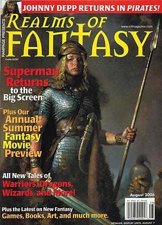
IMO this is a more interesting cover than the first four

realms_of_fantasy_200608.jpg


and this is a nice quirky cover (though not perfect) which interests me more than The Alchemist's cover (though I will be looking for both to read once my current list has reduced)

SirEdrichsTemple-jpg.jpg
 
I like a less realistic style for fantasy art. I like this one:


512j%2B54DKEL._SX317_BO1,204,203,200_.jpg

Quite 19th C Poster style. I think I have scans of some Art Nouveaux Events and Theatre posters in a similar style. I like them, perhaps they'd suit a particular kind of Fantasy.

I think the outer background detracts a bit as does the amount of small text on it.

I think there has always been good and bad covers in all genres. Also a cover could be good art but inappropriate for a book at all, or just inappropriate for a particular book.
 
Just on Sir Edric, the revised cover has his figure a fair bit bigger [I was keen to have him smoking, with a loaded crossbow, as that both fits the story and indicates his character].

Weirdly, this thread reminds me of one of James May's Toy Stories. Specifically, the changing art of Airfix model boxes. The older ones had bombs falling and ships being blown up, whereas the newer ones are sanitised, with explosions removed or diminished and all sense of danger absent, (or reduced, at least).
 

Back
Top