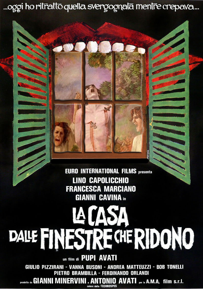
I've recently had to replace an entire washload of tee shirts because some bleach got in (long story) and ruined all my dance clothes. I like to design my own and I've wanted to do one of my favourite Giallo film The House With The Laughing Windows, but the poster has a woman tied up in the window (Giallo, natch) and there are differences between the Italian, German and Brit versions.
I got the Italian poster and added some new elements replacing the tortured bloody woman with the unorthodox painting of St Sebastian from the films (nb, daggers, not arrows??) and then got a window frame to set over it and distressed it to match the painting and I'm quite pleased with the outcome. I doubt I'll be able to wear it for dance classes though or the kids'll have nightmares.

Also, as a huge M R James fan, I made this as my iPad cover using the same style as my Beanwriting brand.

Anything, but write my synopsis for Gollancz, eh? (2 days till deadline)
I got the Italian poster and added some new elements replacing the tortured bloody woman with the unorthodox painting of St Sebastian from the films (nb, daggers, not arrows??) and then got a window frame to set over it and distressed it to match the painting and I'm quite pleased with the outcome. I doubt I'll be able to wear it for dance classes though or the kids'll have nightmares.
Also, as a huge M R James fan, I made this as my iPad cover using the same style as my Beanwriting brand.
Anything, but write my synopsis for Gollancz, eh? (2 days till deadline)

