Tickety Boo Covers Feedback Forum...

What I try to do as a cover artist is to create an original image as in Inish made up from several digital pieces.

I don't want to just buy an image and stick a name and title on. ( sorry Ratsy XX)

I still like the original IH cover but I don't think it is getting the message across.
 
What I try to do as a cover artist is to create an original image as in Inish made up from several digital pieces.

I don't want to just buy an image and stick a name and title on. ( sorry Ratsy XX)

I still like the original IH cover but I don't think it is getting the message across.

I wasn't suggesting you use a stock image, just saying I liked the feel of it - it was more romantic than any of the others and felt like something could be watching the couple.
 
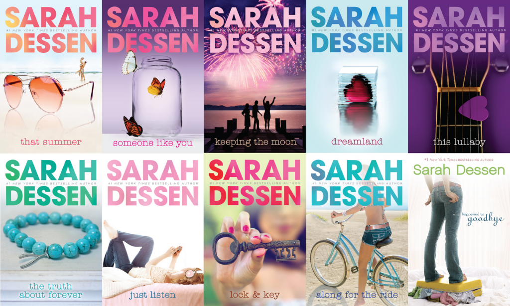
Gary, trying another (less Mills and Boonish) track; I don't know what's going on in Romance, but I've noticed that in YA there seems to be a trend away from entire and recognizable people on covers to details of things or details of people on covers. Look at these covers for books by best-selling author Sarah Dessen, for instance:

Sarah-Dessen-Book-Covers-1024x614.png


Been noticing a lot of this style of thing lately (Sarah's are not particularly good, just the first author who came to mind as an example). So maybe instead of the couple, full-on, identifiable, you could use a detail, like hands held. And then you could still use the beach, or a city scene, but faded out a little in the background. Okay, I'm rubbish at cover design, just giving a very broad idea here. :)
 
Juliana, those probably sell well...they are soft and safe, and have a lot of on trend things with young women. Throw in a yoga mat and we are rolling in it
 
I think the hardest thing is combining romantic comedy and fantasy. Wish there was a planet and space ship in the story - sorted.
 
have a lot of on trend things with young women

Well, yes, it would have to be something more appropriate. Just meant the style, having focus on details rather than the large picture.

Wish there was a planet and space ship in the story - sorted.

You do love the ol' space ships, don't ya?!

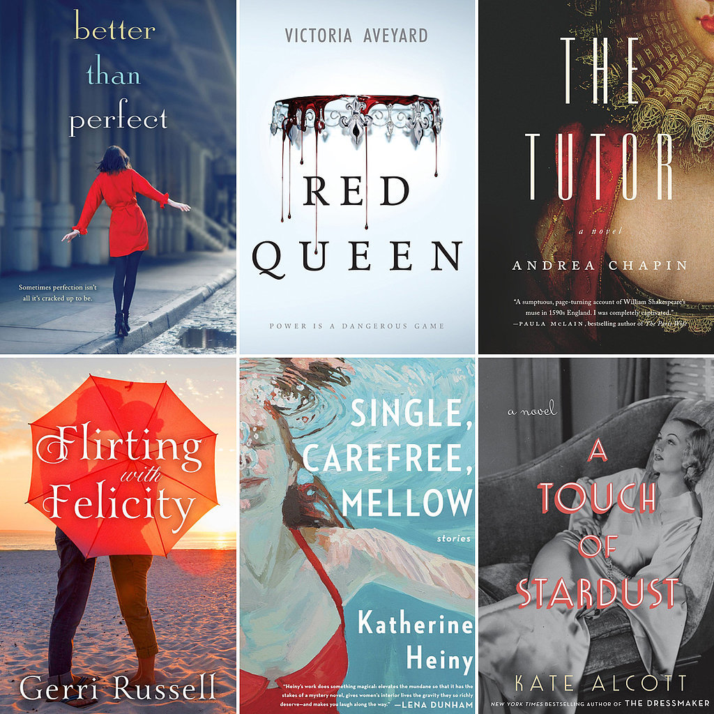
A few more: see how many of these tease more than show?

Best-Books-Women-February-2015.jpg
 
The best one (by a country mile) is the one Ratsy found. Stylistically it is bang on when one looks at the top Romance sellers.

Looking down the top listing on Amazon for Romantic comedy, (I'm discounting the ones with titles such as Grind, Hard, Billionbear or have a scantily clad bloke with abs like mine on it as assuming they don't quite fit the tone) they follow that style.

I've managed to get down to page twenty without seeing anything like the fairy one.

Yes there is something to be said for being experimental. It might work but it probably won't. Ultimately people know what they like and are unlikely to deviate too far from it.

It doesn't have to be that image, but the theme is right. The next best is the Big Ben one - Big London romances do have a massive following.

I've expressed my opinion on the fairy already. I'm not going to wax lyrical - but it's the strongest negative I can politely give. Not a single Romcom out of 200 have anything stylistically similar. (I've also got to page five in Romance fantasy...nothing like it either... however you may want to consider re titling it to Indigo Heart Bear... there's a lot about bears on there )

Right, I'm off to do some crunches!
 
I'd rather watch mushrooms grow as you are not my type darling :)
 
Last edited:
I think, Ralph, that you should be looking at covers for Paranormal romances, since the story is far more a fantasy than it is the kind of books whose covers you are looking at. And even so, the book fits more as fantasy with romance than romance with fantasy. It's important to sell the book to the kind of readers who would enjoy it than to sell it to readers who would be expecting the kind of book that goes with the kind of covers you think would work. It is difficult, though, since the book is so niche.

Most importantly, it is the first book in a series, so it needs to attract readers who would like it enough to buy the rest of the series. If there was just the one book to think about, one could be cynical and not worry about whether people get the book they expect. so long as they buy it and that's money in the bank. But I don't think Gary wants to be that kind of publisher, and the book is meant to be part of a series.
 
When they say "in London", I think more of a city street scene.

Here's a thought:
594790694-thames-street-lamp-promenade-street-holding-hands.jpg


If you could fit a fairy (not that one, but one that looks more natural, and considerably smaller) sitting on the rail, or in the tree...
 
That's a good thought, Sam, although that picture is very, very dark on my screen, and it would have to be something brighter.

Since it is a series, though, there might be some way to use the fairy (or a fairy) as a logo instead.

However: It's been a while since I read the story, but I don't remember the prospective romantic partners wandering the streets of the city together. At all.
 

Similar threads


Back
Top