Tickety Boo Covers Feedback Forum...

The oxygen inside the ship which is huge would get sucked out at impact and that could assist the rocket fuel burning.

I am getting bored with planet - ship - stars. Looking at the top 100 in Space Opera they are mostly that. I have never followed the rules or conform to what everyone else is doing. So always try new things.

However, you and the guys have raised some good points which I will take onboard. This is first draft. Ian liked it. John Jarrold loved the action scenes but thought it was too green. So plenty to think about.

Onwards! :)
 
I am getting bored with planet - ship - stars. Looking at the top 100 in Space Opera they are mostly that. I have never followed the rules or conform to what everyone else is doing. So always try new things.
Follow your instinct on that!
I have some books in 1960s & 1970s to today with covers similar to that and I read them despite the cover style. It is stereotypical Space Opera cover. i.e. 1970s Panther SF covers on E.E. "Doc" Smith, Also some Ben Bova covers.

I look forward to seeing the new things. Though oddly the real photos of Pluto turn out to be somewhat like some 1950s film and book cover conceptions!
http://www.theregister.co.uk/2015/09/18/pluto_crescent_pictures/
see comments!
 
With the greatest respect for my learned Chrononauts, covers aren't about physics they're about grabbing the reader by the throat. Of course a gout of fire can happen in hard vacuum, but only in the blink of an eye. So consider this a battle freeze frame and explode away. It's a great looking cover. Sword? What sword? Good luck with this.
 
An exploding ship is more exciting and dynamic than a ship by itself. Not a right/wrong matter, I think, but I quite like the explosions.

[I think fireballs from spaceships are like FTL drives: something that most people (if they think about it) just agree to give the nod, even though it's impossible/highly unlikely, just because it works in entertainment terms].
 
but I quite like the explosions
Yes, in real life cars in accidents or shot almost never explode (are the exception all Ford Pintos?), in cinema and TV they almost always do. So indeed perhaps poetic licence rather than realism works for covers. If one is having that 40 year long stereotypical style cover at all. if you are having a stereotype, have it good and hard :D
 
I was going to say stuff, but then read the first reply and thought Ralph is spot on with his critique and said everything I was thinking.

I like the green though, that's fine.

The sword is out of place, the fighting and ships look a little wonky and it's too busy. Less is More. I think why the bottom left ship looks weird to me is not only because of the wonky laser cannons, but because the lighting is wrong as well. It's opposite lighting to the ship getting attacked, even though they are on the same angle and should have the same lighting. It's like you've put a light source between them.

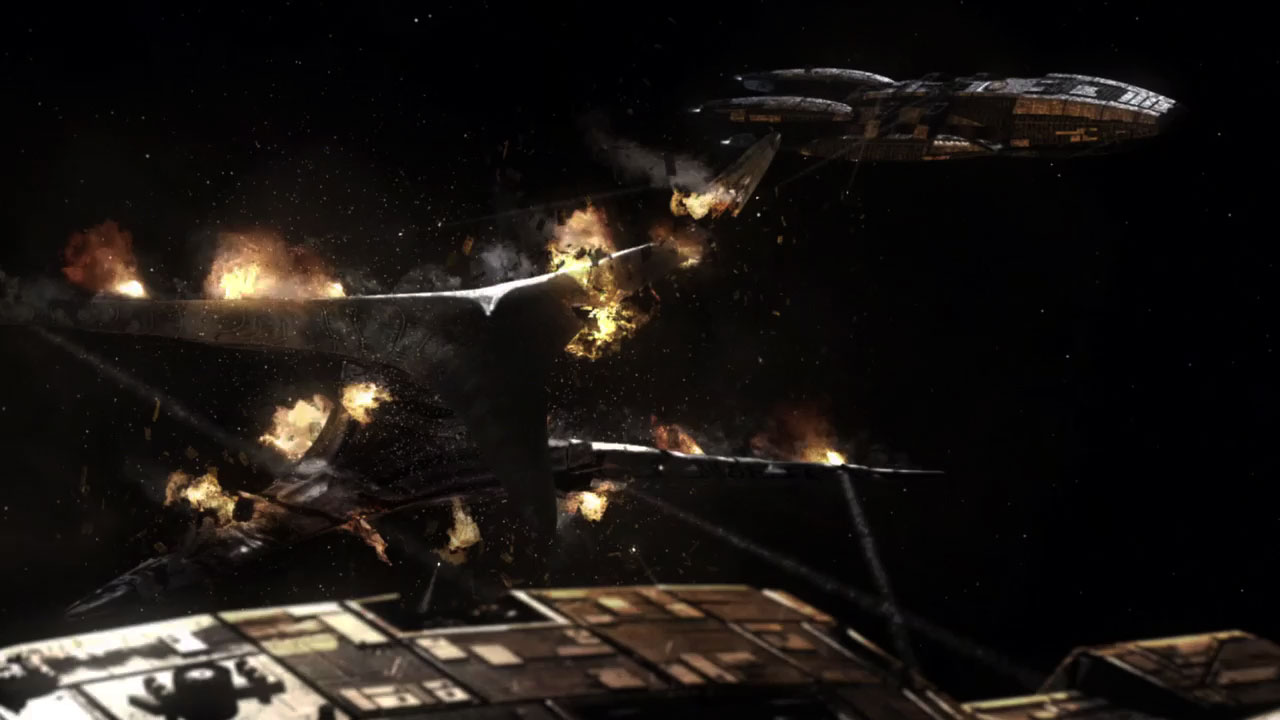
As for the explosions... if Battlestar Galactica can get away with it:

BSGBATTLE.jpg


Then so can Gary. ;)

But in saying that... notice the difference in the explosions. In this screenshot, it's mostly fire. While there is a little bit of smoke, it's not billowing black smoke like Gary has in the draft cover.
 
If the sword needs to be on the cover, could you shrink it and use it as the 'I' in Discord? This would be a much more subtle reference to the universe of the book series. The guard might need to be a bit smaller, so the I doesn't look like a lower case 'T'.
 
So Ralph Kern's Erebus: the second in the Sleeping Gods series, is getting a final spit and polish.

There are 2 versions.

Any opinions/criticisms?

Endurance3.jpg
 
Whilst I prefer the closer up spacecraft, I like the fonts on the right.
 
The left hand one was suggested by Ralph's police colleague in the pub just after I sent Ralph the first! LOL

This is a Tickety Boo tradition being in the pub!
 
I like both pictures, perhaps the one on the left more, but I like the size and location of the title on the left because it's more visible, and the size and location of Ralph's name on the right.

But if you want room for a blurb you'll have to move the space station and Ralph's name up a bit higher (perhaps make his name smaller in aid of that).
 
With what's up there I like the left one best. (Teresa makes me consider that there might be other things to consider.) It just feels more vital, less like a snap shot.
 

Similar threads


Back
Top