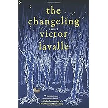
Hopefully designed that darn book cover - opinions please

But I think we have to get used to thinking of ourselves as a brand; that remains, whereas the titles change.

For example I think in terms of when I'm going to be able to read the next 'Stephen King', not what it'll be called.

Maybe in the days before we bought-by-thumbnail it was not such a big issue. I'm a fan of tiny typeface but that would be a bad decision these days when people order online.

pH
 
I just had a look through many pages of Amazon, and I don't think one could make a case for the fonts having to match. At best, it's 50-50.

And I think this cover would fit right in.
 
Hi,

Like the others, nice photo but it doesn't really tell me it's sci fi techno thriller. The only element that comes close to doing that is the eye, but even though it's in the word Oracle, it doesn't tell me much about the book. I'd suggest doing something with the colour balance in the sky to add drama and making the eye a more impactful element. Also same font for author and title. But really I think since the photo is so non- sci fi, I'd go for a more sci fi font altogether.

Cheers, Greg.
 
But I think we have to get used to thinking of ourselves as a brand; that remains, whereas the titles change.

For example I think in terms of when I'm going to be able to read the next 'Stephen King', not what it'll be called.

Maybe in the days before we bought-by-thumbnail it was not such a big issue. I'm a fan of tiny typeface but that would be a bad decision these days when people order online.

pH

My "general understanding" - as in books seen, comments seen online is that the author's name becomes a brand. It doesn't start out that way. With a new writer the reader is buying "a sf thriller" not "a Surname" :) .So yes, with authors like King, Pratchett, Stross - you put the author's name largest these days because they are now a brand. But not when you are starting out. When you are starting out, you want your name clear and readable, even at thumbnail, but less prominent than the title. You are positioning your name to become a brand. I have also seen people offended that the author's name is done larger than the title on a first book.

The book covers that Tinkerdan has uploaded - they look to me that they span at least 30 years of publishing. I would really seriously look at what is being done now.

Anyway, I am now repeating myself :) I've provided links to example covers, commented that caps seem to be the thriller and sf standard at the moment - and its over to you - do some research and tweaking. Pro designers don't just produce one cover for a book - they produce variants and sit and look at them and prod what works and what doesn't. Playing variants with the text is a lot quicker and easier than playing variants with the picture. And you do yourself (even show us) a row of text variants and one might suddenly stand out more than the rest.
 
Last edited:
Cheers @Mad Alice, I'll take a look at that app. I've been using an old Photoshop.

Thanks for the feedback @Brian G Turner . Alas I am nowhere skilled enough to draw over a photo to make the buildings look more sci-fi, and it is a bug-bear - I wanted a futuristic city but have had to settle for flipping the photo to make it look a bit less 'reality'.

And I hate the name David so don't want to be stuck with it if my writing career takes off.
If you like your middle name more you can do that initial then a full middle name thing like the actor, C. Thomas Howell.
I'd be happy to add a robot or lazers or Sci fi-ish bitty bits in if you wish. But I'd need a text free jpeg to muck about with.
 
Just my subjective opinion on the cover shown at the start of the thread: It's not awful, but it's not a best-selling cover. The image does not strongly indicate that it's SF, and is only moderately eye-catching. I don't much like that blurry effect around the towers. The black bar with 'A ----Book' at the top front does not look good. I have no quarrel with the blurb on the back. I don't think the author's name should be bigger than the title, unless the author is so famous that his/her name is the main selling point. If you're an unknown, keep your name in a small font.
I appreciate the reluctance to spend money on a professionally designed cover. The majority of self-published books, even those with nicely designed covers, sell so poorly that their ability to earn back the cost of a custom designed cover is in doubt.
I think we know a great cover when we see it - one on the cover of a best-seller, or one that jumps out when scrolling through a premade cover site. But it's really hard to find or create one that looks right for a particular book.
There's a cover designer called Derek Murphy who has a website and Youtube videos giving what looks like good design tips for book covers.
 
I carefully selected the first 6 for this very reason::
The book covers that Tinkerdan has uploaded - they look to me that they span at least 30 years of publishing. I would really seriously look at what is being done now.

Tempest: A Novel (The Tempest Trilogy Book 1)Jan 17, 2012 by Julie Cross

Faery Moon: A Tess Noncoire AdventureJun 2, 2009 by P. R. Frost

HylozoicMay 26, 2009 by Rudy Rucker

Halting StateOct 2, 2007 by Charles Stross

Rule 34 (Halting State Book 2)Jul 5, 2011 by Charles Stross

Saturn's Children Jul 1, 2008 by Charles Stross
:: and made sure they were within the last 10 years.

::I added the two Heinlein just for fun.
Friday Jul 12, 1983 by Robert A. Heinlein

Friday by Heinlein, Robert A.(April 1, 1982) Hardcover by Robert A. Heinlein

The point is we should be careful about globally applying our own thoughts as rules when evidence disputes.
The first six are all hard bound with jacket that I ordered direct from Amazon within the last year. Granting that they were on sale and I get free shipping.
 
Last edited:
The important thing Dave is to get all this sort of stuff done at the beginning, not after you're out there. Learn now, less mistakes later. I agree with Cosmic Geoff that it's not an awful cover, but it could be a lot better. The author font is totally wrong, I have to say. Experiment with completely different looks, and versions. I've done 4 covers for my next one, and none of them are hitting the mark. So I'll try version 5.
 
Thanks for all the debate and advice guys. My name has been made smaller now, and it is right that the name becomes bigger than the title only when it is the name recognition that's selling the book.

I've uploaded the cover onto Lulu and ordered a proof copy so I can see how it looks in reality. I will then progress from there.

While the cover doesn't scream SF or thriller at this point I doubt anyone will stumble across the book unless they know me or have searched for the genre so they'd already know what it is. If it starts taking off I could always look into a new cover again. While it may not be perfect, this one is soooo much better than what it has now (just type my name into Amazon and you'll see what I mean).

And just as an FYI to clarify, the book isn't cyberpunk and as much a techno thriller as the Bourne or Mission: Impossible movies so the cover wouldn't want to be too SF anyway.

I appreciate all the advice. Everyone has their own thoughts (as you can tell by a lot of conflicting opinions on here) so I will see what I've done so far looks like as a paperback and if I'm not satisfied I'll give some of these suggestions a try and let you all know how it goes.

Again, thanks all. I've been overwhelmed by all the effort everyone has put into helping me out.
 
If you like your middle name more you can do that initial then a full middle name thing like the actor, C. Thomas Howell.
I'd be happy to add a robot or lazers or Sci fi-ish bitty bits in if you wish. But I'd need a text free jpeg to muck about with.

Think I'm even less keen on my middle name to be honest. And there's no robots or lasers in the book. Thanks for the offer.
 
@ tinkerdan. Unless its the last couple of years, it really isn't the latest. Heck - We Are Legion, We are Bob came out last year and the paperback already has a new cover. :) It was a space scene with an overall brownish look to it, now its mostly blue with big space ship in the foreground.
 
Last edited:
So as you all seem like a good bunch with clear ideas, instead of starting a new thread can I ask your thoughts on promoting the book to gain as wide an exposure as possible for relaunch?

Thus far I've pretty much just sold to friends and family (around 100 copies and garnered 3 reviews on Amazon, ironically two 4* from friends and one 5* from someone I don't know). Word-of-mouth was non-existent.

A friend who went through this at the same time I first did and has done rather well out of it (hint: I'm 'following' him) suggested things like an I'll scratch your back concept (you buy and review my book while I buy and review yours, but I'm not sure how to entice people to do that) and building a mailing list (not a clue where to start there).

Thing is I'm rather a shy, unconfident person so being a salesman is massively out of my comfort zone, but this time I'm willing to try what it takes. I'm going to stick a few posters up in my home city but don't think that will help much globally.

So, any hints or tips to help get my book further out there than just my mates?

As always, mucho appreciationess for any advice imparted. You're scratching my back and I won't forget it.
 
Do you have access to a list of ARC readers? Here's a podcast on how to build an ARC list for SFF: SFFMP 94: Putting Together an ARC Team, Getting Lots of Reviews, and Publishing More Often with Anna Hackett – Science Fiction & Fantasy Marketing Podcast If you get more reviews, that seems to help with visibility.

And how much of a re-release are you doing? (I mentioned some of this in a PM to you, but I'll say it here too.) If you've done something like an extensive edit on your book, maybe added some new content, it might not hurt to take down your old book and release it as if it's new. (Just make sure to note in your blurb somewhere that it's a refreshed, re-edited version of a previous release so you don't get some angry readers who already own the old version.) Then you can take advantage of more favorable treatment by Amazon's algorithms. And the first 90 days in KU for your ebook version can't hurt either. (You can publish the print copy anywhere--I think that's still a thing--but you have to be exclusive to Amazon while you're in KU with your ebook.) And I think it's possible to get your old reviews transferred to the newly released version of your book. Don't quote me on that, but I seem to recall others mentioning that, if you email KDP support, they'll transfer reviews to the new release of the same book. (Check into that, though, before you do it.)

Also, look for promo sites that are open to indie authors. Some can be expensive like Bookbub (which is really hard to get anyway--I've never been able to get one, even though I've tried several times), but there are plenty that aren't too bad. I've had some great success from promo sites that will do a promo for around $15 or so.

Finally, start a newsletter. Put a link in the front and in the back of your book to your newsletter signup site--MailChimp is free for the first 2000 subscribers--and start offering your subscribers content that will drive them to your books.
 
Released in the last thirty days.

51ptldbF16L._AC_US218_.jpg
51GTGlFzUTL._AC_US218_.jpg
51SHIqv8r+L._AC_US218_.jpg
51jGDy3O6sL._AC_US218_.jpg
61uv2gYX0hL._AC_US218_.jpg
51MY0-+8atL._AC_US218_.jpg
51JbJq0KwWL._AC_US218_.jpg
61jbRrZbREL._AC_US218_.jpg
61pksIOoD7L._AC_US218_.jpg
51o2DZocS7L._AC_US218_.jpg
 
Those covers are great, @tinkerdan! (And I didn't know Tanya Huff had a new one out. *goes to one-click-buy*)

What I gathered, though, since the book is more of a technothriller set not too incredibly far into the future, these covers might be more to the style of the novel.

51TGCAxvRAL._AC_US436_FMwebp_QL65_.jpg
51xVxdrQtPL._AC_US436_FMwebp_QL65_.jpg
51nKrPgZSUL._AC_US436_QL65_.jpg
51nC9xORAeL._AC_US436_QL65_.jpg
41VMpGtrx-L._AC_SR201,266_.jpg
51gVNSM3P8L._AC_US436_FMwebp_QL65_.jpg
 

Back
Top